Contact Us

Have questions?  Use this form to contact us.

We will respond to you as soon as possible.

Thank You,

Gary Detonnancourt


Harrisville, RI 02830
United States

More Than A Snapshot provides online photography education.

Booth Bay Harbor 2013-5410-color enhanced.jpg

Blog

This is the blog for More Than A Snapshot's Online Photography Classes.  In these blog posts I will give photography tips, tutorials, and show images.

Filtering by Tag: rule of thirds

6 Tips to Improve Your Landscape Images

Gary Detonnancourt

Guest blog post by Marion Faria

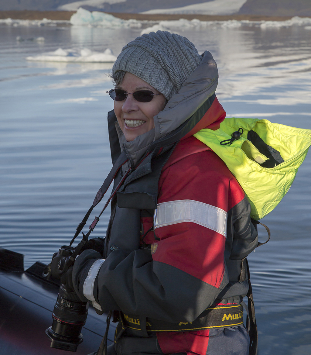
Guest Blogger Marion Faria

Guest Blogger Marion Faria

I am a passionate and quirky photographer concentrating primarily on landscape photography.  My images have been printed in NANPA Expressions magazine. The image of The Road to Fitzroy was the cover image for Lonely Planet's "Best in Travel" 2015 book.  I have won numerous Spider, black and white awards, also, images of the day at earthshots.com, Shutterbug Magazine and Bing. Finalist for image of the month at Popular Photography.  My stock images are represented by Getty Images.  http://marionfariaphotography.com/


1. The "rule of thirds", which almost every photographer has heard about, can work most of the time.  If you are struggling with composition, it would be wise to use this as a starting point until you are more confident. It is based upon the Golden Mean which was used by painters for many centuries as a guide to composition.

The image above demonstrates the use of the "rule of thirds"...it is beneficial to a composition to place a major subject on one of the crossed lines.  

2. The composition of landscapes can be improved by using certain graphic elements.  Some elements draw the eye into an image, others add strength and tension to an image...it is important to recognize graphically what is in your composition.

The illustration above gives you an idea of the elements that can improve an image.

3. As a landscape photographer, I shoot almost entirely in Aperture Priority, switching to Manual as needed, which isn't very often, usually as night approaches.

4. When shooting landscapes, you want to use the lowest native ISO for your camera, mine is 100, some are 200.  Using a low ISO is important for helping to avoid excess noise in an image.  Using too much noise reduction can diminish the quality of an image.

5. Compose vertically as well as horizontally; it gives you another option and can improve a composition.

Lake Louise, Banff National Park, Alberta, Canada

6.  Of course the most important thing of all, in landscape photography!  Wait for the best light.  The light is what will elevate an image from ordinary to extraordinary. Notice the difference between images 4 and 5.  In image 4 the light is dramatic, as is the sky; in image 5, the light is good on the mountain peak but flat everywhere else.

Canadian Rockies, near Banff

Mount Rundle from Vermillion Lake, Banff National Park

The Rule of Thirds

Gary Detonnancourt

Some people hate to follow the rules.  The good news is, in photography you don't always have to because the "rules" are meant to be broken.  Following the "rules" is a helpful way to get started and they will very often help you to create a pleasing image.  The only problem with the rules is they can limit your freedom of expression and creativity.  "They" say once you know the rules you know enough to break them and still get away with a pleasing image, so here we go let's start with the most basic rule of composition the rule of thirds.

The tic-tac-toe type grid can help you to figure out where to place your subjects.  Image by Gary Detonnancourt

Place the main subject or subjects on one of the 4 inside cross points.  Avoid putting your subject dead center in the image because it tends to be a boring composition.  Occasionally you can get away with putting your subject right in the middle if the subject is very symmetrical like in the image below.

I call the four cross points the sweet spots for placing a subject.  You can actually turn on a grid like the one above in most cameras'.  This will help you frame up your shot right in the camera.  

How to set up grid lines for a Canon camera.

Grid lines are helpful when aligning subjects vertically or horizontally. With a Canon Rebel T3i, there are three grid options: None, 3 x 3, and 5 x 5. This feature is called Grid Display in the Menu options.

Step 1: Press the Menu button.
Step 2: Navigate right, to the fourth tab.
Step 3: Select "Grid display" and then your preferred options: None, Grid 1 (3x3) or Grid2 (5x5).
Step 4: Make sure you're in Live View to be able to view the Grid overlay.

How to turn on grid lines on a Nikon, like the D300.

The question now becomes which of the four sweet spots should you use when deciding where to place your subject.  When it comes to the left or right side, you should go with the right side if you live in a country that reads from left to right.  Our eyes are used to reading an image, in the same way, we read words.  If you place the subject on the left side, our eyes come into the image on the left and then stop on the subject and we don't really look at the rest of the image.  Whereas, if you place the image on the right side our eyes come into the image from the left, go through most of the image and then run into the subject.  Don't worry if you accidently shot the subject on the right side, there is an easy was to fix it in Photoshop.  Here is an example:

In Photoshop click on Image>Image Rotation>Flip Canvas Horizontal

This is the image after it has been flipped, now your eyes have time to come into the image and then run into the butterfly.  Image by Gary Detonnancourt

When trying to decide between the upper third or lower third sweet spot I often go by whichever one will maximize the most interesting part of the image.  If the sky is the most interesting I will use the lower third and if the foreground is more interesting I will use the upper third as shown in the images below.

Notice the horizon is in the lower third because the sky is more interesting than the foreground.  Image by Gary Detonnancourt

In this image, the horizon is in the upper third to show off an interesting foreground.  Image by Gary Detonnancourt

Homework:  Go through your image collection and pick out some images to post below, in the comment section of this page, that meet the rules shown above.  Also, feel free to ask questions, make suggestions or comments about this article.

I hope you found this article helpful,

Gary Detonnancourt

morethanasnapshot.com